Customisation
The Customisation Tab allows you to personalise the appearance and behaviour of your AI Assistant so it represents your brand’s voice, tone and colours.
The chat preview on the right side of the page allows you to see live how the changes look on your AI Assistant (Genie).
❗️ Remember to click the save button in the top right of the page, so you don't lose your changes.
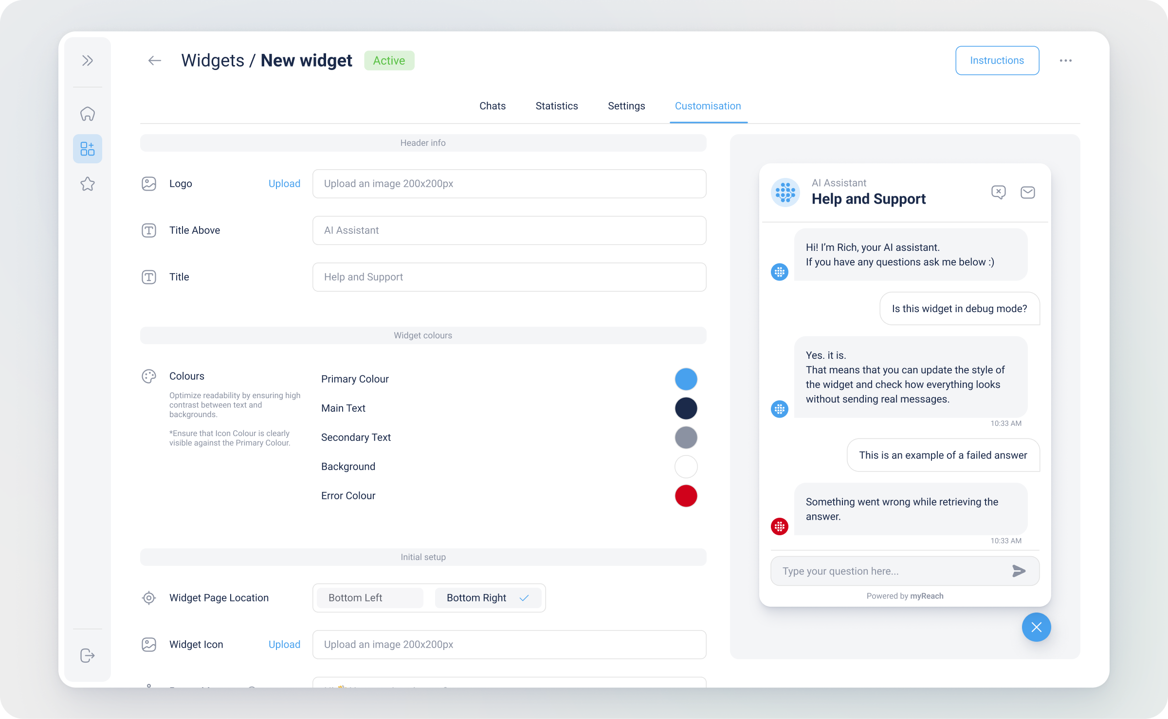
Setting up a Genie (AI Assistant) is a quick and easy setup with multiple customisation options, including:
Initial Setup
-
Initial Logo: Upload your company's logo to appear in the header of the Genie.
-
Initial Logo Frame: You can choose to display the initial logo within a round frame (recommended for logos with a background color) or use no frame (recommended for square/rectangular images with a transparent background).
-
Initial Title: The text that appears in large bold letters (What can I help you with?) in the centre of the AI Assistant chat.
-
Initial Subtitle: The small text that appears under the title of the AI Assistant chat. It is optional.
-
Quick Questions: Pre-defined quick questions that users can choose from. Here it's useful to add the key questions that users are most likely to ask (ex: what is the return policy? How are you better than your competitors? etc.).
Both Titles are set by default but can be changed to something more tailored to your company.
Chat header
In the header of a conversation, the logo/image is always presented in a round frame and cannot be animated (.jpg/.png format). Only visible in fullscreen
-
Header Logo: The text that appears in large bold letters in the centre of the AI Assistant chat.
-
Title: The default title Help and Support appears at the top of a widget.
Appearance
-
Theme: Select the theme from the options: Light, Dark or Auto.
-
Colours: Customise the colours used in your AI Assistant for branding consistency.
Genie
-
Genie icon: Upload the icon you want to appear in the bubble of the AI Assistant answers. It can be your company's logo, or something else.
-
Genie Page Location: Define where the AI Assistant should appear on your webpage. By default, it will be set to "Bottom Right".
-
Button size: Select the size of the AI Assistant icon.
-
Popup Message: The message that appears next to the Genie icon when a customer opens your website. Triple Enter ↵ to create separate message bubbles. You can choose to hide the message by disabling the "show popup message" toggle or user can hide it by clicking on 'X' when they hover on the popup in the website.
-
Genie Launch State: When enabled, the Genie will automatically open in its fully expanded state as soon as the page loads, making it instantly visible to visitors without requiring them to click to open it. This is useful if you want to immediately draw attention to the Genie and encourage users to engage with it right away.
Contact
- Contact button: The contact button is displayed in the top bar of the Genie chat and is required. Indicate the URL or email address of your company that you want users to be redirected to when they click the contact button (e.g. help@yourcompany.com). This allows users to easily reach out for further assistance beyond what the Genie can provide.
New Tab Fullscreen
- New Tab Button: When enabled, a button is displayed in the top bar of the Genie chat that allows users to open the chat in fullscreen in a new tab, while keeping the original page open. You can set a custom URL for the fullscreen Genie — if left empty, it will default to the Genie URL.
Header button tooltips
-
Tooltip Contact Us: The text that appears when you hover over the "contact page admin" button on the top right of the chatbox. By default it is "contact us" but it can be changed.
-
Tooltip New Tab Fullscreen: The text that appears when you hover over the "open fullscreen in a new tab" button on the top right of the chatbox. By default it is "New Tab Fullscreen" but it can be changed.
-
Tooltip New Chat: The text that appears when you hover over the "start a new chat" button on the top right of the chatbox. By default it is "New Chat" but it can be changed.
Placeholders
-
Input Placeholder: The placeholder text that appears in the "Type your question here..." space. You can change it to fit your company's preferences.
-
Contact message: Input Placeholder: The placeholder text that appears when user asks a question about the category with email setup and gets an option to add email.
Resolution feedback message
-
Small Title: A short subtitle displayed above the main title. By default this is set to "Before closing the chat..."
-
Title: The main question displayed to the user. By default this is set to "Have your questions been resolved?"
-
Thumbs Up: The label for the positive response button. By default this is set to "Yes"
-
Thumbs Down: The label for the negative response button. By default this is set to "No"
Errors
- Error Message: By default, the error message is "Something went wrong while retrieving the answer" but it can be changed.